
The Future of Sales and What It Means for Your Business
Level 2 - Value Investor

Welcome Avatar! As mentioned earlier the Jungle is continuing to grow rapidly. We’ve lost count of the number of people making money online at this point but its probably in the 30-50 range. BowTiedSystems is here to talk to you about the future of Sales and how to adapt to the upcoming changes. If you intend on running a business or already run one, this post is for you!
Be sure to subscribe to BowTiedBull if you want to continue getting ahead of the masses. We’ll continue to find talented people like Systems every day of the week.

The future of sales is looking bleak for the average salesperson. Most are technically illiterate and solely focus on their sales ability. While that will get you results you’ll also hit a ceiling fast.
If you’re reading this you’re one of the few people that will *get* it.
Technology adoption turns hyperbolic during a recession or any major event promoting budget cuts, layoffs, or dramatic changes in the market. Covid-19 was a good example of what this looks like.
Take this Mikensy study from 2021 on tech adoption during Covid-19
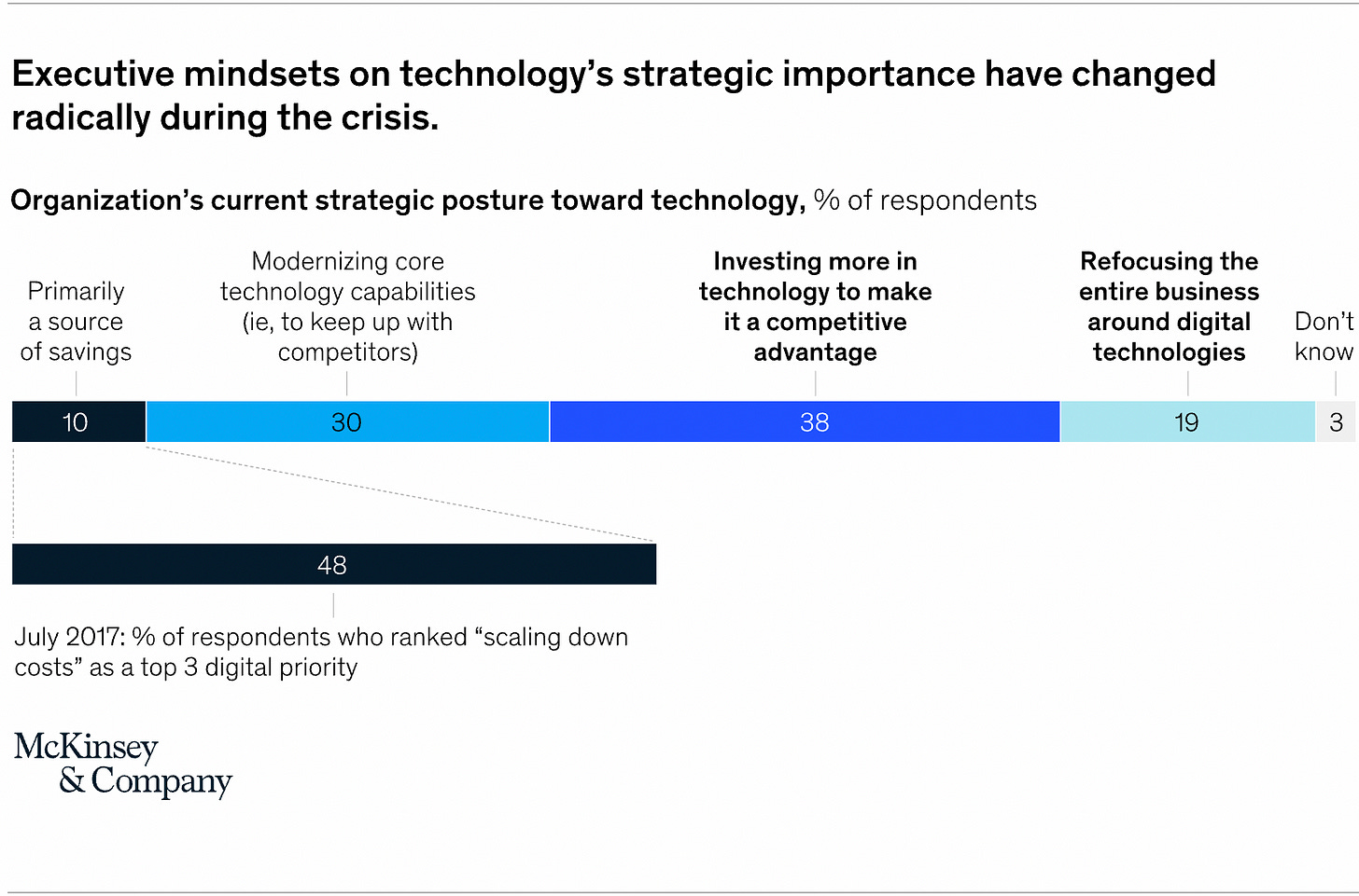
38% invested in new tech. 30% upgraded tech to stay competitive. 19% changed their entire biz around leveraging tech. That’s a whopping 87% that shifted to leveraging technology more.
This recession will see very similar approaches in workforce management.
Now, much of this tech automation during Covid-19 was around labor management. Zoom. Online workspaces. Docsend. Software like that. This article will address sales tech and how it will impact the future of sales.
The dinosaurs before the asteroid
Many companies & reps I’ve consulted with + companies I’ve worked at are still living in the dinosaur age.
They are:
Using CVS
Manually tracking when to send emails and reach out to leads (not using a cadence software)
Not using event-based triggers (funding round, growth, layoffs, etc…)
Sending/calling to low-quality unverified data
Calling one phone # at a time
Sends all emails from 1 domain
Have a bloated CRM with old info
If these companies go head to head with a competitor that leverages sales tech they’ll lose 10x over
Vs a sales tech-focused company
Companies that are using optimized sales technology
CRM is up-to-date and cleans for accurate revenue predictions
CRM contact info is up to date with any changes in the market
Has a calling system that ensures calls don’t get marked as spam
Calls 10 phone #s at once ensures a call is always picked up
Calls only verified accurate phone # with a high connection rate
Sends from 15+ domains so emails always get delivered
Uses event-based triggers to target companies looking to buy
Has hyper-targeted messaging around event-based triggers with a high response rate
Uses cadence software to always send the right email at the right time without thinking about it
I’ll compare this to the old sales methods and you’ll see why this org will blow the other out of the water.
The power of sales technology
Let’s run some numbers here.
Company #1 has a team of 10 salespeople and is leveraging sales tech
Company #2 has a team of 20 salespeople and is not leveraging sales tech
I’ll level the playfield here and assume both companies use a contact info scraping tool.
Comapny #1: 10 sales reps
1 rep can make 300 calls within 1 hour = 10 reps x 300 = 3000 Calls per hour
They use a power dialer so they can call multiple phone # at once and only speak with prospects that answer the phone.
1 rep can send 100 emails per day *and do not land in spam* = 10 reps x 100 emails = 1000 emails per day
They send from multiple domains and clean/verify email data before sending therefore ensuring it doesnt land in spam.
1 rep can find 20 qualified companies per hour = 10 reps x 20 companies = 200 qualified companies per hour
They use software like ZoomInfo to find qualified companies based on advanced filters therefore not spending time manually researching companies via google.
1 rep can find the DM (decision maker) at a company in 1 min = 10 reps x 60 DMs per hour = 600 DMs per hour
They use software like Zoominfo to filter for DMs while simultaneously filtering for qualified companies. So the work is already done.
This sales org/company can find companies based on funding rounds, job changes, growth, shrinkage, layoffs, M&A, the technology used, news, type of company, 10k reports, new location expansion, etc… & can create processes around these filters to automatically add qualified companies to their outreach strategy the second the filter is triggered.
So much of the company prospecting process can be eliminated due to automation.
They also clean their CRM data so if anyone changes jobs or changes an email/phone number it gets automatically updated in the CRM. This makes the outreach process more effective due to not wasting time on bad info.
Comapny #2: 20 sales reps
1 rep can make 100 calls per hour. 20 reps x 100 = 2000 calls per hour
This is because each rep can only make 1 call at a time. This is also not assuming that 50% of the numbers are bad/wrong person. *it can be more in some cases around 60-80%*
1 rep can send 50 emails per day *but 70% land in spam* = 20 reps x 50 x .70% = 300 emails per day
This is because they’re not using a cadence software to send emails, not verifying emails by checking to see if they bounce before sending & sending all emails from 1 domain, therefore, landing in spam at a higher rate. 70% is being generous. It’s worse in many cases.
1 rep can find 2 qualified companies per hour = 20 x 2 = 40 qualified companies per hour
Because this company doesnt invest in tools like ZoomInfo or Crunchbase so they have to manually research company news via google.
1 rep can find the DM at a company in 10 minutes = 20 reps x 6 DMs per hour = 120 DMs per hour
The reps at this company were never taught how to use their contact scraping software so they waste time manually searching through an employee list to find the DM.
It’s worse than you ever thought…
What does this look like in terms of end results?
Gartner says it takes between 22.5 - 30 calls to have a conversation with a prospect depending on the type of phone number (direct dial vs corp call directory)
Click here to read the article
Out of those appointments/meetings, about 21% are qualified and only 58% make it into the pipeline, and 21.8% close. FYI if you want to get this close rate above 50%+ check out @bowtiedsalesguy course: Click Here Or DM him for consulting: Click Here
Click here to read the article
For cold emails, it’s even worse. But for the sake of simplicity, we’ll assume a 2% reply rate & 21% reply to booked meetings for both companies. (which is high in most cases believe it or not)
Running the numbers
If we run the numbers for both Companies 1 & 2 from above we get these results
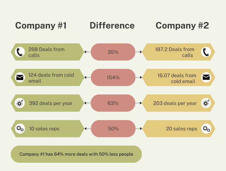
Company #1
Cold Calling
300 calls per rep ÷ 13.3 convos ÷ 3 convos to meeting = 4.4 meetings booked x 21% qualified = 0.92 meetings per rep per day x 10 reps = 9.24 pre-discovery call qualified meetings
Out of the 9.24 meeting per hour ÷ 58% qualified = 5.3 meetings that are qualified ÷ 21.8% close rate = 1.12 deals closed
Cold Email
100 emails per rep ÷ 2% reply rate = 2 replies ÷ 21% booking rate = .42 meeting booked x 10 reps = 4.2 meetings ÷ 58% qualified = 2.43 qualified meetings ÷ 21.8% closed = .52 deals closed
Company #2
Cold Calling
100 calls ÷ 4.4 convos ÷ 3 convos to booked meeting = 1.48 meetings per rep ÷ 21% qualified = .31 qualified meetings per rep per day x 20 reps = 6.2 meetings per hour
Out of the 6.2 meetings per hour ÷ 58% qualified = 3.6 meetings that are qualified ÷ 21.8% close rate= .78 deals closed
Cold Email
100 emails per rep ÷ 30% delivered = 30 emails sent ÷ 2% reply rate = 0.6 replies ÷ 21% booking rate = .126 meetings book x 20 reps = 2.52 meetings booked ÷ 58% qualified = 1.46 qualified meetings ÷ 21.8% closed = .06 deals closed
If you want to calculate how your org is performing here’s the formula:
Cold call:
First, determine a timeframe. 1 hour. 1 day. 1 week. Etc.
Y calls ÷ Y convos ÷ Y meetings booked ÷ Y% qualified on avg ÷ Y% qualified after discovery call ÷ Y closed x # of reps = Performance
Cold email:
Cold email is difficult to calculate due to deliverability being a variable. If you have that use this formula:
Y emails ÷ Y emails delivered ÷ Y reply rate ÷ Y% booked ÷ Y% qualified ÷ Y% qualified after discovery call ÷ Y% closed x Y # reps = Performance
Results 1 year later
48 working weeks per year on avg x 5 days per work week = 240 working days per year
As you can see when you correctly use sales technology you can multiply your sales efforts almost dramatically.
This isn’t to mention the time saved and morale boosted by sales reps not wasting time on inefficient processes and lost deals.
Now, this gets really interesting when we calculate how much time is wasted at company #2:
Wasted 2x more time cold calling with 50% more sales reps
70% of all time spent crafting, sending & following up via email is wasted
5x more time spent prospecting for qualified companies
5x more time spent finding DMs
Let's assume reps at both companies have 4-hours of solid work per day.
48 work weeks per year x 5 workdays a week x 4 hours per day = 960 hours per year spent working
For Company #2 to get the same results as Company #1 they would have to spend 14688 hours a year PER sales rep
That’s an additional 293,760 hours a year 20 reps would have to work to get the same results as company #1
Each sales rep would have to spend 15.3 hours additional hours PER DAY
2 more hours of cold calling
3.3 more hours sending cold emails
5 more hours prospecting for qualified companies
5 more hours spent finding DMs
It’s truly astounding once you run the numbers. If this seems unbelievable just run the numbers yourself. The math checks out.
How will the recession change this?
Simple. It’s cheaper to use sales technology than it is to hire more salespeople. When you use sales technology you multiply your sales efforts and decrease management overhead. If you can manage sales reps via software instead of a sales manager why would you hire a sales manager? And if you can get the 2x more results from the current reps you have there’s no need to hire more reps.
The issue is companies don’t know how to use sales tech!
I’ve spoken to and examined sales organizations and their sales technology from small 1 person agencies to VC back startups to fortune 500 companies and everything in between.
No one knows what I’m talking about! It’s crazy!
The very software that reps are spending 6+ hours inside of each day don’t know what they’re doing. Management doesnt know either. Even the salesperson that sold the sales tech software doesnt know!
If you’re reading this you are early.
This recession will force companies to re-examine their sales processes, eliminate waste, and increase automation. It’s a simple decision to make once it clicks.
Now, this isn’t all doom and gloom. This means there’s a massive opportunity to help companies implement sales technology & for reps at sales tech companies to crush their quota by leveraging sales tech!
Bonus
Now if you’re reading this and you’re a sales rep or in charge of sales for your company and want to learn how to leverage your current tech stack or build one out from scratch contact me on Twitter @bowtiedsystems or email me at bowtiedsystems@gmail.com
If you’re using Linkedin Sales Navigator and want to get more deals and become a sales nav god check out my course: Click Here
Subscribe to BowTiedSystems
Disclaimer: None of this is to be deemed legal or financial advice of any kind. These are *opinions* written by an anonymous group of Ex-Wall Street Tech Bankers and software engineers who moved into affiliate marketing and e-commerce. We’re an advisor for Synapse Protocol and on the JPEG team. Currently homeless.
2017-2020 Old Books: Are available by clicking here for paid subs. Don’t support scammers selling our old stuff
Security: Our official views on how to store Crypto correctly (Click Here)
Social Media: Check out our Instagram in case we get banned for lifestyle type stuff. Twitter will be for money.
Great write up. Would love to see some sort of flow chart / infographic that details how to use systems together, in what order, how to automate them, etc.
Great writeup. The numbers in all of your graphics are way off though. For example, 3000 calls per hour vs 2000 calls per hour is not a 40% difference, it’s a 50% difference. 1000 emails per day vs 300 per day is not 107.6% difference, it’s a 333% difference. 200 companies v 40 companies is not a 133.3% difference, it’s a 500% difference! etc. etc. The real math would make your scenarios MORE impactful.